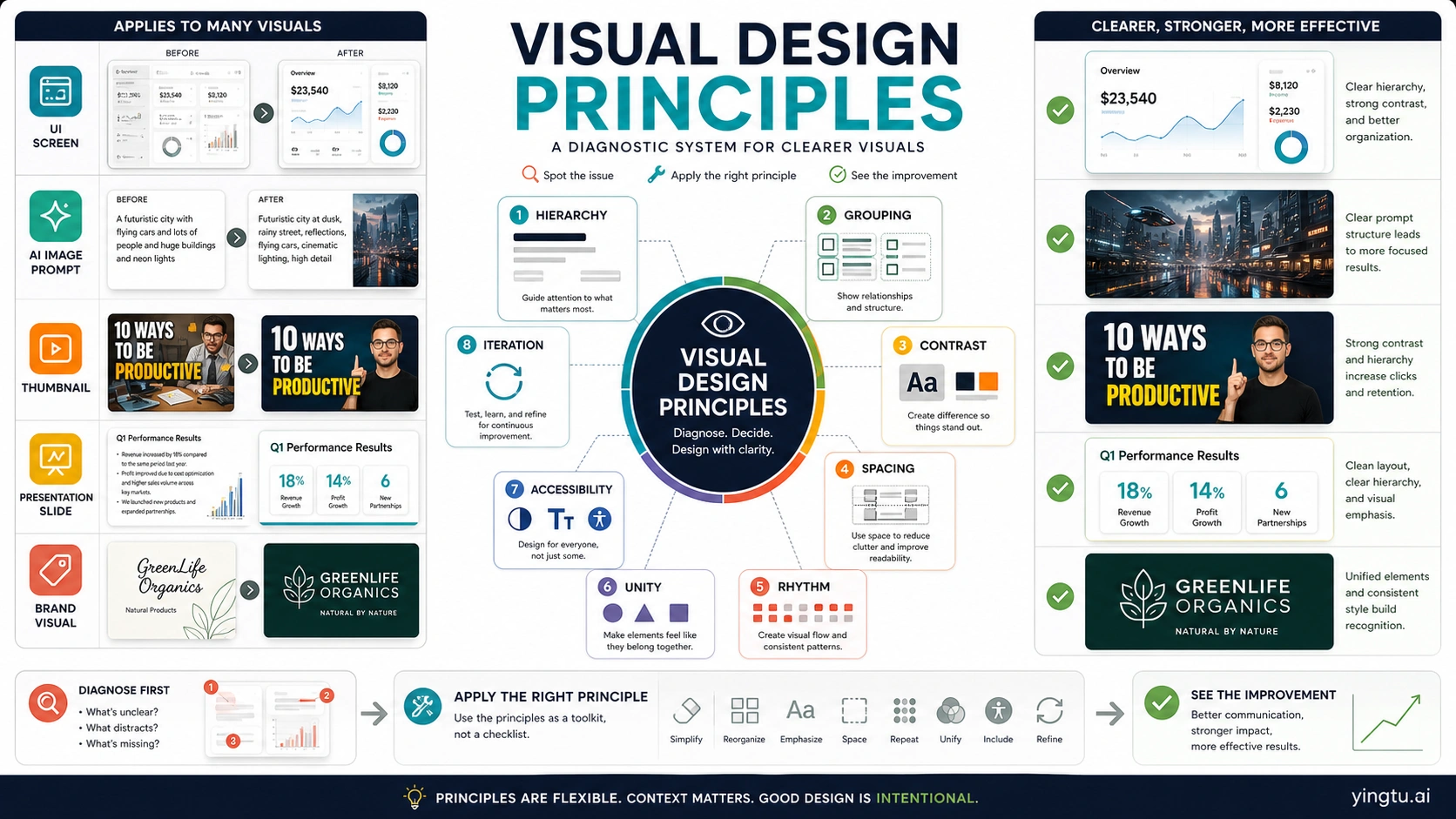
Visual design principles are practical rules for making a visual easier to understand and act on. They control where attention goes first, which elements feel related, whether text and shapes have enough contrast, how space creates breathing room, and whether the whole composition feels intentional.
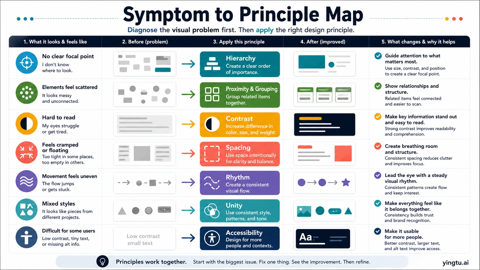
There is no single universal count. UX, graphic design, and art/design sources group the ideas differently, so the useful move is to work with a diagnostic set: message, hierarchy, grouping, contrast, spacing, rhythm, unity, and accessibility.
| When the visual feels... | First principle to check | What to change first |
|---|---|---|
| No clear focal point | Hierarchy and scale | Make one message visually dominant before styling the rest |
| Scattered or unrelated | Grouping and proximity | Move related elements closer and separate unrelated ones |
| Hard to read | Contrast | Increase difference in color, value, size, or weight |
| Cramped or floating | Spacing and balance | Add breathing room where the eye needs structure |
| Polished but confusing | Unity and rhythm | Repeat the right patterns and remove competing styles |
| AI image looks impressive but unusable | Principle-based review | Turn "make it better" into a specific hierarchy, contrast, grouping, or spacing revision |
Quick answer: use a working set, not a fixed count
Visual design principles are not one official checklist owned by one source. NN/g frames UX visual design around scale, hierarchy, balance, contrast, and Gestalt. Figma teaches a broader graphic-design vocabulary including alignment, color, white space, repetition, movement, proximity, and unity. Toptal explicitly notes that designers do not agree on a single count, while Berkeley Library teaches art and design principles such as balance, emphasis, movement, pattern, rhythm, proportion, variety, and unity.
That disagreement is useful if you stop treating the count as the goal. Most lists point at the same jobs: direct attention, show relationships, create readable contrast, organize space, repeat patterns, and make the result feel coherent. The working set below keeps those jobs visible:
| Principle | Reader-facing job | What it controls |
|---|---|---|
| Message | Decide the main point | What the visual is for |
| Hierarchy | Guide the eye | Focal point, order, scale, weight |
| Grouping | Show relationships | Proximity, alignment, clusters, separation |
| Contrast | Make differences readable | Color, value, size, weight, texture |
| Spacing | Give structure room | Negative space, density, balance |
| Rhythm | Create movement | Repetition, sequence, pattern, pace |
| Unity | Make it feel intentional | Consistent style, tone, components, rules |
| Accessibility | Keep the result usable | Text contrast, size, alt meaning, cognitive load |
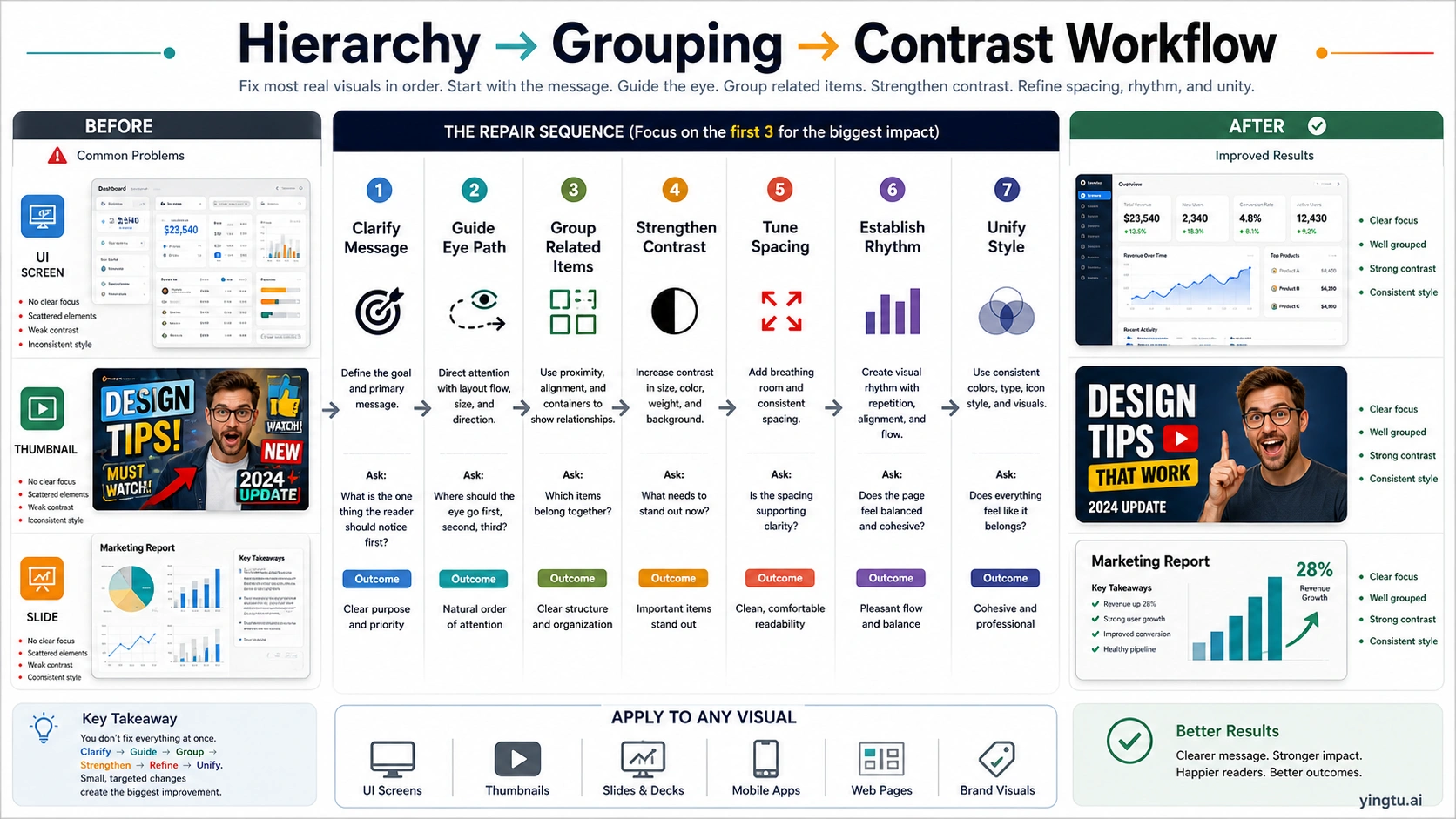
The fastest improvement usually comes from applying one principle to one visible problem. A messy dashboard rarely needs a new color palette first. It needs a clearer primary metric, grouped controls, better contrast for labels, and enough spacing for the eye to move.
Start with message and hierarchy
Start with the message before you adjust style. A visual can be beautiful and still fail if the viewer does not know what to read first, what action to take, or which element carries the point. Hierarchy is the principle that turns that main message into an eye path.
Hierarchy uses scale, position, contrast, weight, and order. A landing-page hero may make the offer visually dominant, then use supporting copy, proof, and a call to action in descending importance. A dashboard may put the current state first, trends second, exceptions third, and secondary navigation last. A thumbnail may need one dominant phrase and one image cue, not six competing badges.
Use a hierarchy pass like an editor:
| Check | If the answer is no | First repair |
|---|---|---|
| Can someone name the main point in three seconds? | Everything has similar weight | Enlarge, isolate, or darken the main message |
| Does the eye know where to go second? | The layout has no sequence | Use size, position, and spacing to create a path |
| Are secondary items visibly secondary? | Support content competes with the headline | Reduce contrast, weight, detail, or proximity |
| Does the call to action look like the next step? | It blends into other controls | Give it clearer contrast, position, and affordance |
Scale is not only about making something large. It is about making importance visible. If every element is bold, nothing is bold. If every card is equally saturated, the viewer has to work out priority from text alone. Good visual hierarchy lets the structure carry part of that cognitive load.
Use grouping, spacing, and balance to show relationships
Grouping is the fastest way to show what belongs together. Proximity tells the eye that nearby items are related; alignment tells the eye that items share a structure; separation tells the eye that one group is different from another. These ideas are often described through Gestalt principles, but the practical question is simple: does the layout make relationships obvious without extra explanation?
Spacing is not empty decoration. Carbon's spacing guidance treats space as a system for relationships and hierarchy. A tight label and input feel connected. A wider gap between form sections says the task has changed. A consistent spacing rhythm helps a product surface feel predictable instead of assembled from unrelated pieces.
Balance is the distribution of visual weight. Weight can come from size, color, density, imagery, motion, or contrast. A page can be symmetrical and still feel unbalanced if one side has a heavy dark image and the other side has small pale text. Balance does not mean everything is equal. It means the composition feels stable enough for the viewer to trust the order.
Use this repair sequence when the layout feels scattered:
- Circle the elements that answer the same reader question.
- Move related items closer together.
- Align edges, labels, and controls so the group has structure.
- Add more space between groups than inside groups.
- Remove decorative separators that fight the spacing system.
- Recheck whether the main message is still dominant.
This order matters because grouping and spacing often fix problems that people misread as color problems. A report may look "dull" because the key numbers are buried in equal cards. A brand graphic may look "off" because the logo, tagline, and product image are not aligned to any shared structure. A mobile screen may feel too complex because related controls are spread across the page.
Contrast should create emphasis without sacrificing readability
Contrast makes differences visible. It can be light versus dark, large versus small, bold versus regular, saturated versus muted, textured versus flat, or still versus moving. In visual communication, contrast has two jobs: help the viewer find important things and make content readable enough to use.
The accessibility boundary is not optional for text. WCAG 2.2 Success Criterion 1.4.3 sets minimum contrast at 4.5:1 for normal text and 3:1 for large text, with defined exceptions. That does not mean every good design is only a ratio. It means a visual that relies on low-contrast body text, tiny labels, pale chart legends, or image-backed copy may be visually fashionable while still failing readers.
Contrast is strongest when it is selective. If every headline, icon, badge, and button uses the highest contrast available, the result becomes noisy. If the primary action, warning, or main data point has the strongest contrast and supporting elements step back, the visual becomes easier to scan.
Use this contrast pass:
| Surface | What to inspect | Better contrast decision |
|---|---|---|
| UI screen | Primary action, error state, labels, helper text | Make actions and errors distinct while keeping body text readable |
| Thumbnail | Main phrase, face/object, background | Separate subject and headline from visual noise |
| Slide or chart | Title, key number, axis, legend | Emphasize the takeaway, not every data mark |
| Brand visual | Logo, product, message, background | Protect recognition before adding texture |
| AI image | Focal subject, text area, overlay, busy background | Ask for cleaner value separation and calmer negative space |
Contrast can also reduce decision friction. A pricing card, feature comparison, or checklist should not force the reader to decode importance from paragraph length. The contrast system should say which option is recommended, which caveat is important, and which details are secondary.
Repetition, rhythm, and unity make the visual feel intentional
Repetition turns isolated choices into a system. Repeated type scales, spacing increments, icon styles, corner radii, chart colors, image crops, and interaction states make a visual easier to trust because the viewer can learn the pattern. Rhythm is the movement created by those repeated choices. Unity is the feeling that the whole visual belongs together.
Good repetition is not sameness. A dashboard can repeat card structure while still giving alerts stronger emphasis. A deck can repeat title placement while varying chart types. A brand campaign can repeat color, texture, and type while changing the hero image. The point is to make variation feel governed rather than random.
Carbon's typography guidance is a useful implementation reminder: type choices create hierarchy and organize information. A visual design principle becomes much more practical when it is encoded as a repeatable rule: one heading scale, one body scale, one caption style, one spacing ladder, one alert color system, one chart palette. Without rules, every new screen or image becomes a fresh negotiation.
Use unity as the final polish check, not the first move. If the message is unclear, making all colors consistent will only make the confusion prettier. If grouping is weak, adding a brand texture will not create relationships. First fix the job. Then make the parts feel like they came from one system.
Use the same principles on AI-generated visuals
AI visuals need critique, not just regeneration. A generated image can look impressive at first glance and still fail as a thumbnail, ad, UI concept, poster, deck image, or brand asset. The useful question is not "is it pretty?" The useful question is "does it communicate the right thing quickly, clearly, and safely for the surface?"
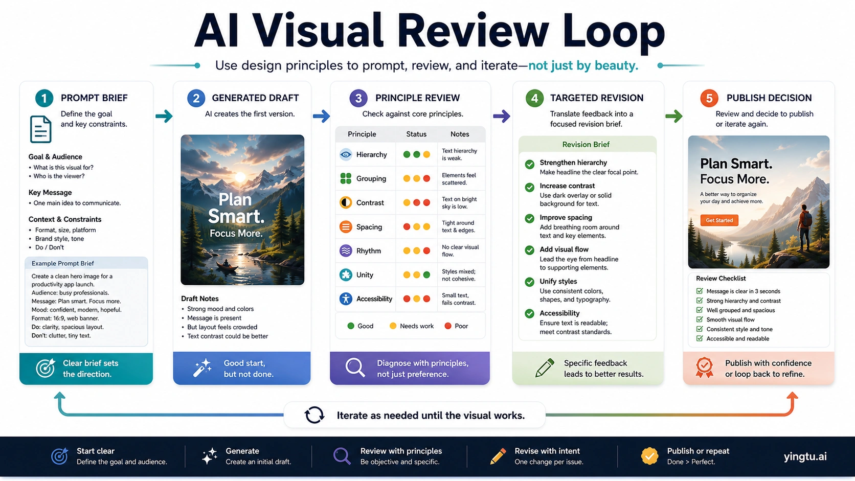
Write prompts with principle language:
| Weak request | Principle-based request |
|---|---|
| Make it more professional | Create a clearer hierarchy with one dominant subject, calmer background detail, and more negative space |
| Make the text pop | Increase readable contrast between headline area and background without adding visual clutter |
| Make the layout cleaner | Group related elements, align major edges, and create more space between unrelated sections |
| Make it match the brand | Use a consistent type mood, palette, icon style, and image treatment across all visible elements |
| Make it better | Name the exact problem: weak focal point, scattered grouping, low contrast, cramped spacing, uneven rhythm, or mixed style |
Review the first output as if you were reviewing a human-made draft. Identify one or two principle failures, then ask for targeted changes. If the focal point is weak, do not also change palette, framing, type, background, and mood in the same revision. If the text area is unreadable, ask for stronger value separation and less background detail behind the copy. If the image feels inconsistent with a brand visual, ask for a tighter color system and repeated shape language.
A browser image testing route can help when the next step is fast prompt comparison rather than production integration. For example, yingtu.ai can be used as a browser image creation or testing entry point when you want to compare visual directions against a checklist before asking engineers to build an API workflow. Keep the boundary clear: that is a practical testing surface, not an official model-owner claim, pricing promise, limit promise, or production guarantee.
If the task is a full AI design canvas workflow, the adjacent Claude Design guide is a better follow-up. The principle check still comes first: know what good hierarchy, grouping, contrast, spacing, and unity mean before judging the canvas output.
Apply the principles by surface
The same principles behave differently depending on the surface. A UI screen needs task clarity. A thumbnail needs instant recognition. A deck needs a takeaway path. A brand visual needs consistency and trust. An AI image prompt needs enough direction to make the output useful without overloading the model with contradictory instructions.
| Surface | First question | Principle pressure |
|---|---|---|
| UI screen | What should the user do next? | Hierarchy, grouping, readable contrast, spacing, accessibility |
| Landing page first screen | What offer or category is visible immediately? | Message, hierarchy, visual weight, contrast, proof placement |
| Thumbnail or social graphic | Can the viewer understand the promise while scrolling? | Scale, contrast, focal point, image/text separation |
| Slide or infographic | What is the one takeaway? | Hierarchy, rhythm, chart contrast, annotation, negative space |
| Brand visual | Does it feel recognizable and controlled? | Unity, repetition, color system, type mood, image treatment |
| AI image draft | What revision would make it clearer? | Principle-based review, targeted prompt language, done-check |
For UI and product surfaces, hierarchy and grouping usually matter before color styling. For thumbnails and social graphics, scale and contrast usually decide whether the piece is noticed. For slides, the key risk is burying the takeaway under chart furniture. For brand visuals, unity protects recognition. For AI images, the risk is accepting attractive noise because the image looks finished.
The useful habit is to describe the failure in principle language before changing the design. "The headline is not dominant enough" is easier to fix than "the page feels off." "The chart legend has low contrast and sits too far from the data" is more actionable than "the chart is confusing." "The generated image has a strong mood but no readable copy zone" is better than "try again."
Final done-check
Use this checklist before you approve a visual:
| Check | Pass condition |
|---|---|
| Message | The main point can be named in a few seconds |
| Hierarchy | The eye path is clear: first, second, third |
| Grouping | Related items are close, aligned, and visually connected |
| Contrast | Important differences are visible and text is readable |
| Spacing | Dense areas and open areas feel intentional |
| Rhythm | Repeated elements create flow instead of monotony |
| Unity | Type, color, shape, icon, image, and tone feel governed by one system |
| Accessibility | Text contrast, size, labels, and meaning work for more than one ideal viewer |
| AI revision | Feedback names a specific principle failure instead of asking for generic improvement |
If a visual fails several rows, do not fix them all at once. Start with message and hierarchy, then grouping and contrast, then spacing and rhythm, then unity. That order prevents the most common waste: polishing a visual before it communicates.
FAQ
What do these principles do?
Visual design principles are reusable rules for making visual communication clearer. They help control attention, relationships, readability, space, movement, consistency, and usability. Different traditions group them differently, but the practical job is the same: make the visual easier to understand and act on.
How many should I use?
There is no universal number. Some UX sources teach five broad principles; graphic-design resources may list twelve or thirteen; art/design education may group them into another set. Treat the count as a teaching choice, not a law. Use a working set that helps you diagnose real visuals.
Which one matters most?
For practical work, message and hierarchy usually come first. If the viewer cannot tell what matters, contrast, color, texture, and polish will not solve the main problem. After the focal point is clear, grouping and contrast usually create the next biggest improvement.
Are visual design principles the same as graphic design principles?
They overlap heavily. Graphic design principles often include balance, contrast, alignment, repetition, proximity, hierarchy, color, white space, proportion, movement, emphasis, and unity. Visual design for UI and product work uses many of the same ideas but ties them to usability, task completion, accessibility, and interaction.
How do they apply to UI design?
In UI design, principles decide what the user sees first, which controls belong together, which action is primary, whether text can be read, and whether the screen feels predictable. A usable interface is not only attractive; it must show structure and action clearly.
How do they help AI image prompting?
They turn vague feedback into useful revision language. Instead of saying "make it better," say the focal point is weak, the background fights the text, related objects are not grouped, the contrast is too low, or the style lacks unity. That gives the next generation or edit a concrete target.
Can a visual look good but still fail?
Yes. A visual can be stylish, polished, or dramatic while still hiding the main message, making text hard to read, scattering related items, or creating the wrong emphasis. Beauty is not the same as clarity, usability, or trust.